
2/24/2016 v1.02
(First run through, hopefully does not need too many corrections. Please keep the feedback and comments coming - they will make the next version even better, thanks - sshah@mbsmantrallc.com)
This document is subject to the Disclaimer in the Disclaimer Page linked above. Please read the Disclaimer in its entirety. If you print this out, there is a Disclaimer at the end - please read that.
Summary and Conclusions
The scope of this analysis is vast, and it covers many topics that are linked.
* At its heart, this is an analysis and discussion of how Macro Economics and Money Supply works in today's world, and it has significant policy implications. It will challenge what you think you know about US and Global Economic History and how Markets work. You will need an open mind to understand the linkages and conclusions.
* I prove that the current practioners of Macro Economics - Central Banks - have their theory backwards. Macro Economics changed in 1999, and responses to policy have inverted since then.
* I believe that I have proven the hypothesis that I postulated in 2009:
The Shah Theorem: "When One Economy Enters a Liquidity Trap, All Monetary Policy Fails Globally"
* I also connect Macro and Micro Economics through this analysis, at least for the special case of a Liquidity Trapped Economy.
Money Supply and The Failure of Macro Economics
I analyze the Japanese and US Economies. The relationships that follow work well since the links between these two economies are almost completely market based, with almost no regulatory friction between them. Capital flows and currency prices between these countries have no impediments, and demonstrate, with surprising precision, micro- and macro-economics at work.
My analysis shows that:
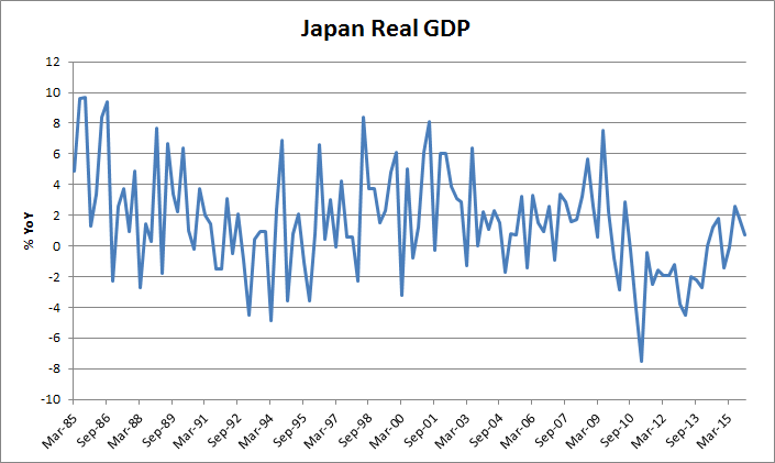
* Under present Economic conditions, cutting policy interest rates reduces money supply and exacerbates recessions, resulting in stagflation and deflation. This has been the case for Japan for 23 years.
* This is the result of a global market for capital. Under such a market design, local interest rate policies cannot be expected to work, and they do not.
* The Carry Trade connects micro- and macro-economics: decisions by individuals to maximize their returns by seeking higher returns elsewhere drive capital overseas, altering money supply in both economies.
* Under Liquidity Trap conditions, Interest Rate Policy and Management fails in the Trapped Economy, and has the opposite outcome from the one desired by policy makers. Rate Cuts reduce Money Supply due to the Export of Capital and Savings, as investors seek higher returns in other economies. They also export the maximum amount of capital that they can. A significant proportion of extra Money Supply that is created from Quantitative Easing and other Non-Conventional Policy Measures is also exported.
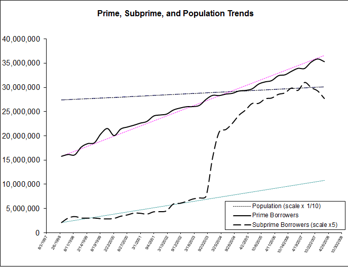
* Money Supply and Velocity in a Recipient Economy increases through receipt of capital from the countries that are in Liquidity Traps. Monetary Policy also fails in Economies that are recipients of Carry. They cannot control their money supply, and are subject to Asset Inflation from the import of capital. This is usually seen in Housing and Stock Market Prices. Rising asset prices increase debt issuance and leverage, further accelerating asset price growth. Economies become leveraged through debt issuance.
* If a Non-Trapped economy is already in a recession in spite of the receipt of Carry Money Supply, traditional policy measures such as cutting rates will have adverse impacts, as money supply will decline even more due to retraction of Carry, and this will eventually lead to it being Trapped too, in turn exporting its capital to other countries. This can lead to a global negative spiral of Trapped Economies.
* In other words, Monetary Policy fails in both Trapped Economies as well as Receiving Economies, and with time, All Economies.
* Money Supply Management though Policy Interest Rate changes no longer works, and has the opposite-to-desired result as it fuels Carry Trades. Central Banking Theory has been Inverted as a result of Japan entering its Liquidity Trap. Standard Monetary Policy is now impotent.
* Under Liquidity Trap conditions, the only way to increase Money Supply is through Quantitative Easing and increasing the size of Central Bank Balance sheets. This is highly inefficient as much of this will get exported, however, there is a chance some of the money supply thus created might remain resident.
The Pricing of Assets
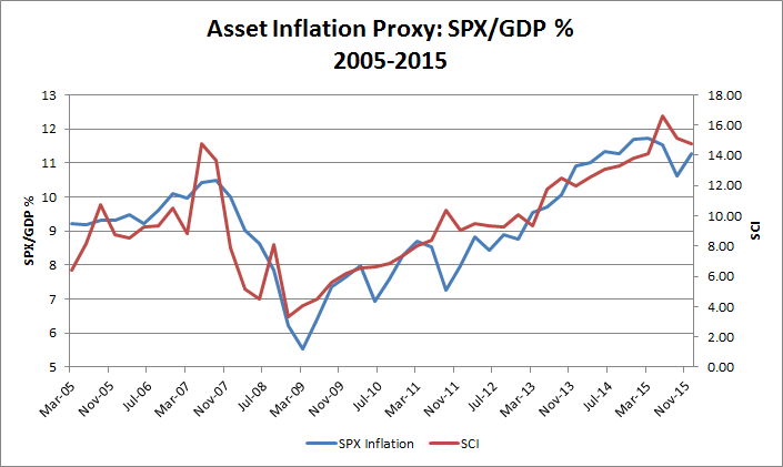
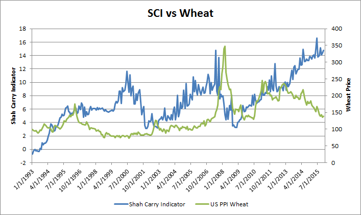
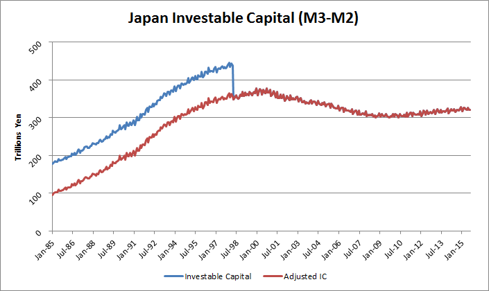
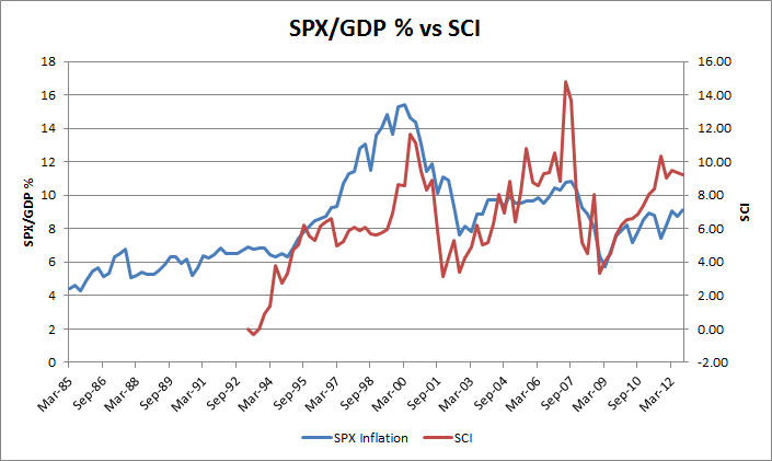
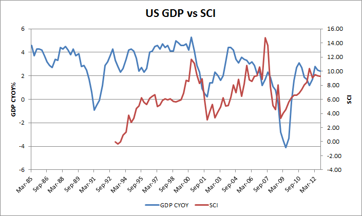
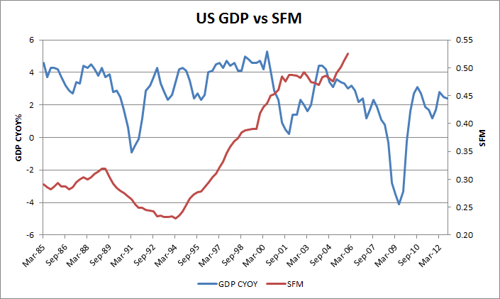
* While it is widely accepted that asset prices are influenced by money supply, what has changed since 1994 is that it is money supply and carry from global sources that determines asset prices, not just local money supply. Asset Pricing in an Economy is determined by the Total Supply of Carry available.
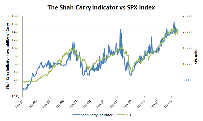
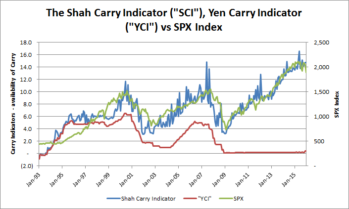
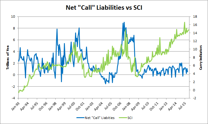
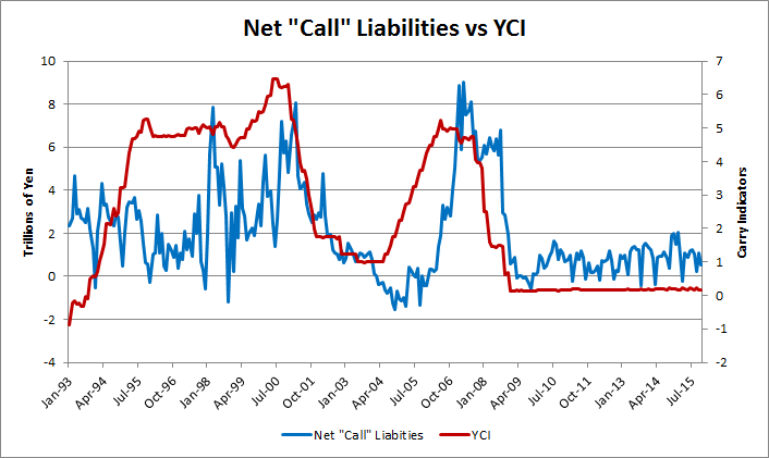
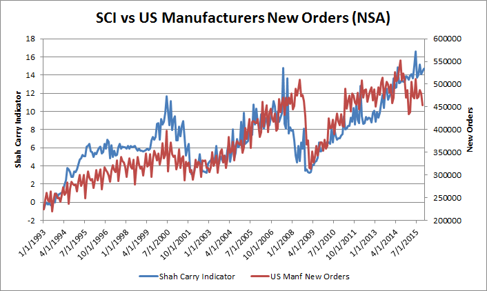
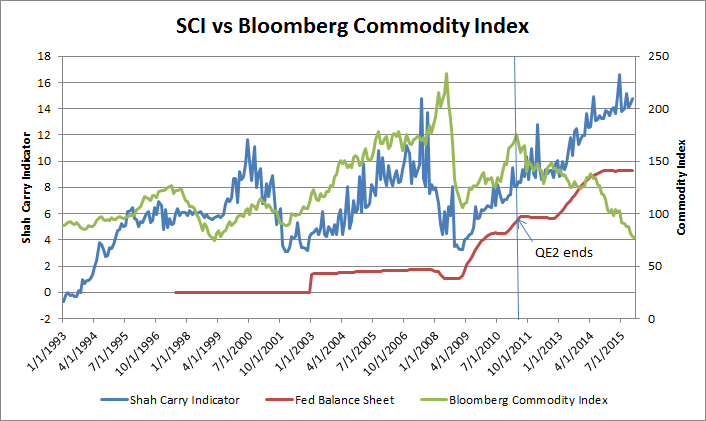
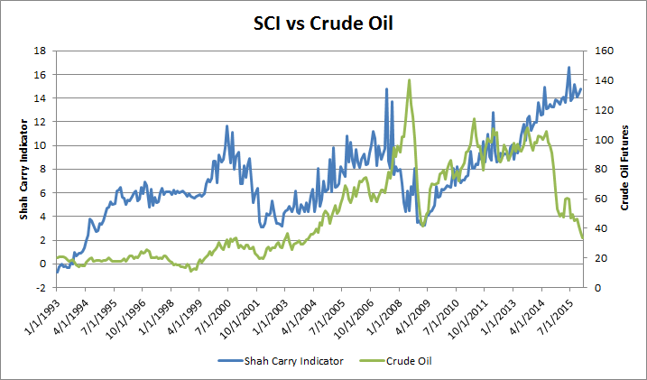
* I define the Shah Carry Indicator that captures Global Carry for an economy, and that explains the prices of many asset classes over long periods of time.
* Traditional valuation metrics of assets, such as expected returns, or discounted cashflows, are not necessary to explain asset prices and price movements.
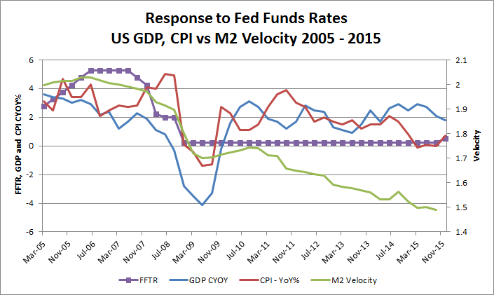
Changes to Economic History - the US response to Policy Rates.
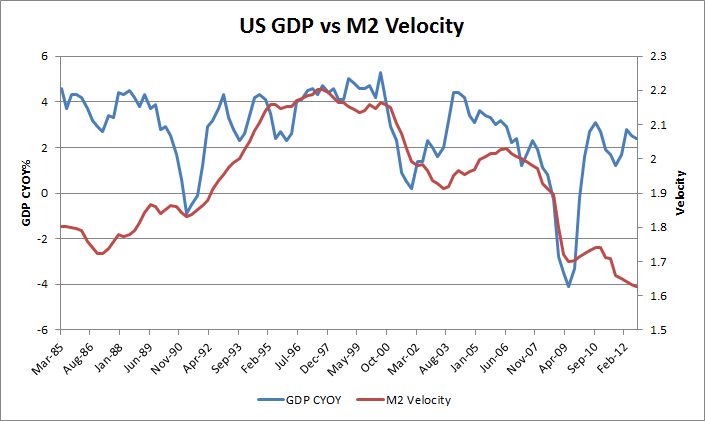
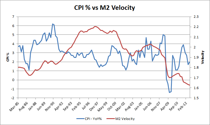
I analyze multiple periods between 1985 and 2015, and test the effectiveness of US Monetary Policy in each period. I confirm that, after 1999, when Japan entered into a Liquidity Trap, US Monetary Policy ceased to be effective, and instead had the opposite-to-desired effect on the US Economy.
The conventionally accepted US Economic history since 1999 is incorrect, as it does not take into account all the factors that impacted the US at the time. I correct this by completing the analysis of these periods. I also identify the parties responsible for the Great Financial Crisis.
The Present and Future
This analysis gives you the framework to analyze any period for any economy, and allows you to understand the economic impact of policy decisions. I have focused on developing the framework, and providing enough evidence to prove its validity, in the hope that this analysis can reach professional economists and Central Banks.
I will only briefly discuss some of the current themes and concerns in the market. These might get developed more fully in subsequent papers. After all, this document is already long enough.
Genesis of this Analysis
I have been formulating this analysis of Carry Trades and Assets since 2006, when I first researched Carry Trades to understand the Icelandic economy. The magnitude of the Carry Trade emphasizes its impact on markets and its importance to Macro Economics, which heretofore has not been appreciated. That the Carry Trade has inverted the practice of Macro Economics is not understood by most practicioners.
Many parts of this discussion are derived from my prior Crisis Notes (see the Archives) - I discuss the Carry Trade in almost every Crisis Note. The analytical framework that I have used since 1988 - that Hedging and Funding Costs and Flows determine Asset Valuation - has led me to research the supply of capital and the resulting impact on the prices of assets that are described herein. This is a very general framework that can be applied to any economy that is the recipient of Carry capital flows from a Funding Country or countries. I have been making the argument for many years that the US is the world's largest recipient of Carry Funding, primarily from Japan, and that the Global Financial Crisis was primarily a Carry Deleveraging event.
- Carry Trades - describes the various sources of Carry (from the US perspective)
- The Pricing of Assets - graphs showing the responsiveness of various US assets to Carry
- The Failure of Macro Economics - I use Carry to understand Money Supply, and how it redefines Economics. I also analyze different periods in US Economic history to see how Macro Economic policy has performed in each period. I define new tools and indicators to understand flows, currency movements and economic activity.
 Section 1: Carry Trades
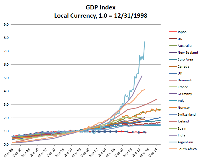
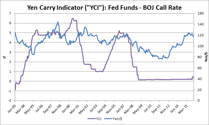
The Yen Carry Trade
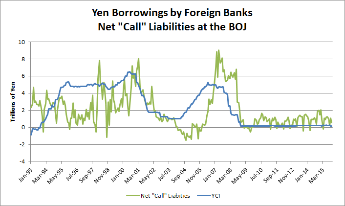
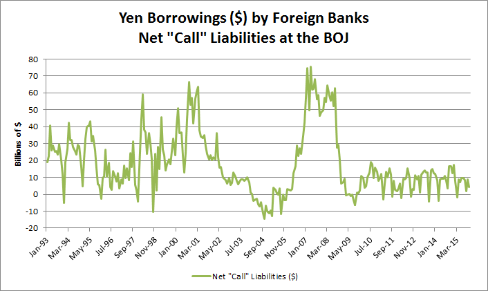
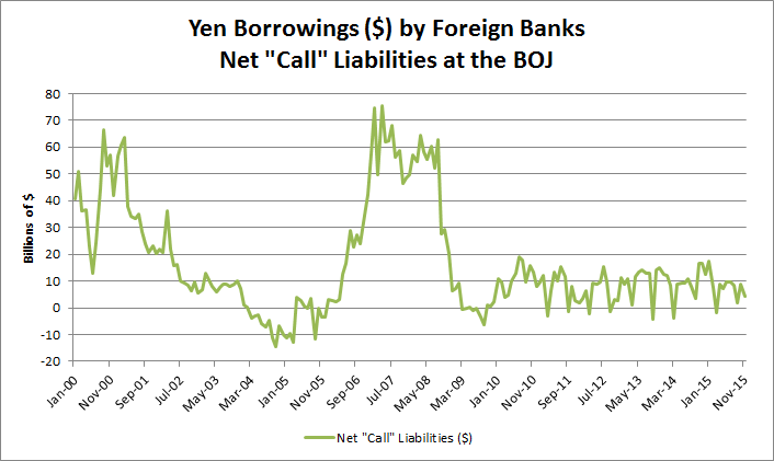
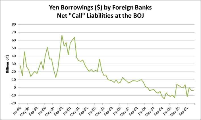
Borrowing by Foreign Banks from the BOJ
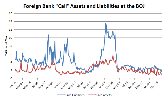
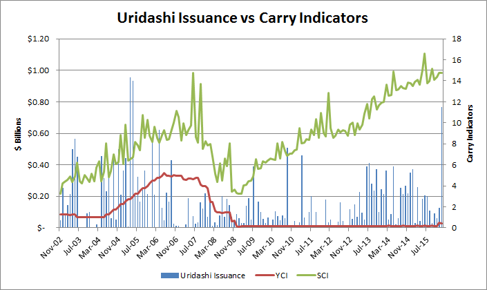
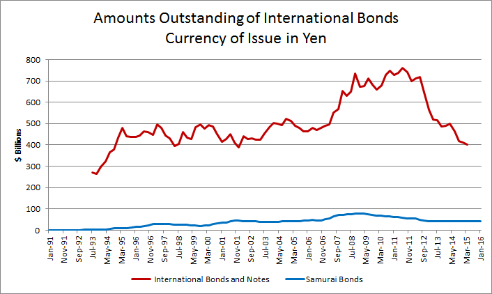
An Uridashi bond is a secondary offering of bonds outside Japan. They can be denominated in Yen or issued in a foreign currency. These bonds are sold to Japanese household investors. An Uridashi bond is normally issued in high-yielding currencies such as New Zealand Dollars or Australian Dollars in order to give the investor a higher return than the historically low domestic interest rate in Japan.During the 2008 financial crisis the carry trade and foreign currency bonds in general came under criticism in Japan for contributing to the crisis.
On the 1st of November, 2015 the size of the Uridashi Bond Market was USD 33.2bn equivalent in 15 different currencies.

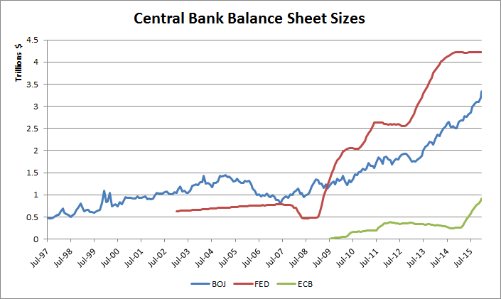
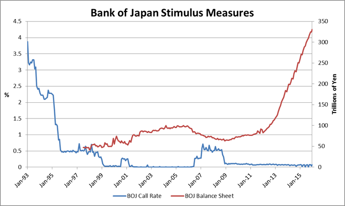
Quantitative Easing (QE) and Central Bank Balance Sheets
Wikipedia has a good definition for QE, so I will use it:
Quantitative easing (QE) is a monetary policy used by central banks to stimulate the economy when standard monetary policy has become ineffective. A central bank implements quantitative easing by buying financial asets from commercial banks and other financial institutions, thus raising the prices of those financial assets and lowering their yield, while simultaneously increasing the money supply.
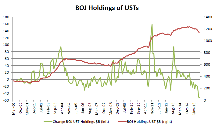
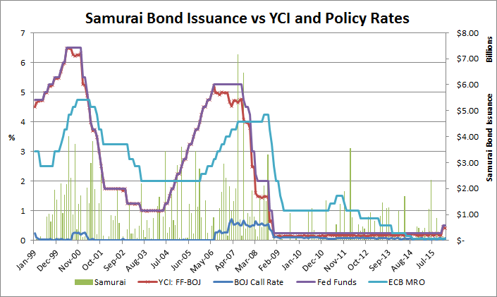
All three major central banks have resorted to QE, at different points in time, after entering Liquidity Traps. The extent of QE that they have implemented can be measured by the size of their (ballooning) balance sheets. The following chart shows the magnitude of their balance sheets (in USD). Combined, they currently total $8.5T, of which approximately $7.5T is as a result of QE.
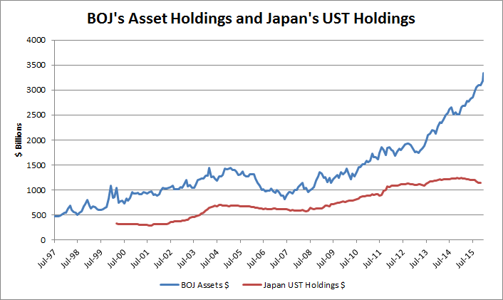
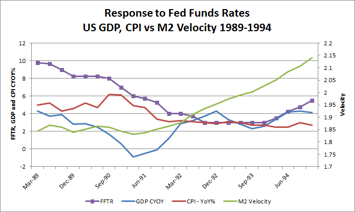
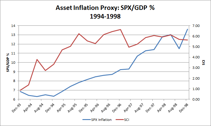
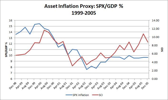
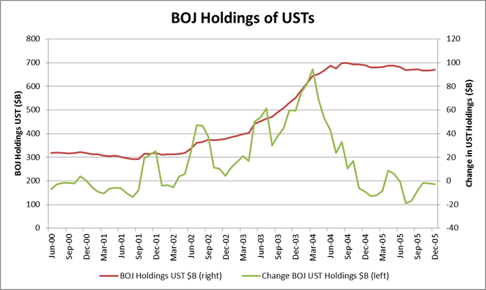
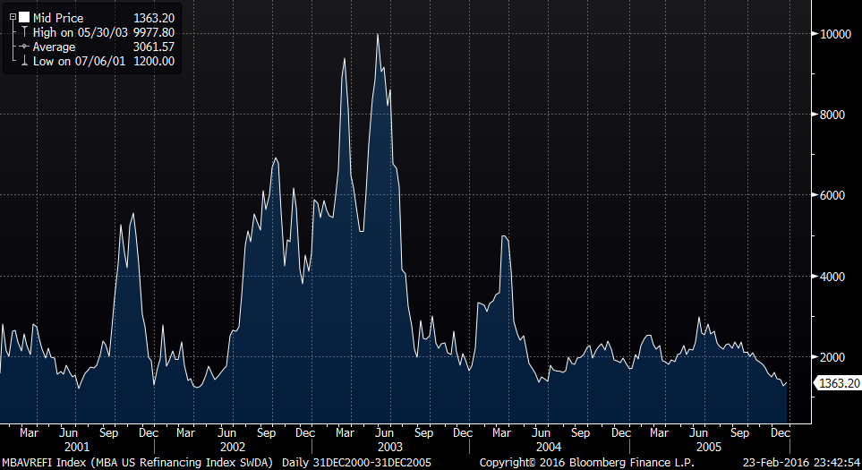
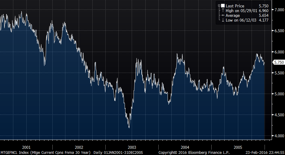
Japan was the first country to enter a Liquidity Trap, and to implement QE. However, in addition to purchasing Japanese assets on its Balance Sheet, the BOJ also purchased a significant amount of USTs - $400B between 2001 and 2004. While these investments were meant to deploy its Balance of Payments Surplus, the BOJ inadvertently supplied QE to the US, increasing US money supply. This was fortituous, as the YCI had declined during this period due to the Fed cutting rates - this QE from the BOJ, more than made up for the decline in Samurai, Net Call, and other forms of Japanese Carry.
I believe this to have been an important factor in the 2003 recovery in the US, resulting in a long rates rally, and playing a part in the mortage refinancing boom that occured, as well as not only limiting the decline in the US stock market, but also helping it turn around and rally.
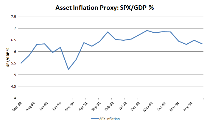
Without the contribution of this QE in the 2001-2004 period, the YCI projected a lower SPX index and thus lower GDP. The SCI incorporates this Japanese QE, and as a result tracks the SPX! This is discussed in detail later.
When US QE was implemented, I had discussed my opinion as to why QE cannot work to recover asset prices, in the section called 'Bonds are not Assets' in the 2009 Crisis Note 'Excess Assets, Keynes, etc'. However, I missed that QE can directly increase the money supply by the amount of bonds purchased. The risk to QE is that much of the money supply created will get exported overseas, which also happened in the US in 2008 (and was discussed in another Crisis Note). What has surprised me has been the amount of QE the Fed has implemented - its Balance Sheet has increased by $4T!
While the ECB's activities have not been very relevant to US asset pricing to date, Mr. Draghi's recent comments to 'do what it takes' might change the ECB's contribution to Carry Trades and US asset pricing. ECB data is being shown for that reason, although it has not been incorporated into the Shah Carry Indicator as yet.
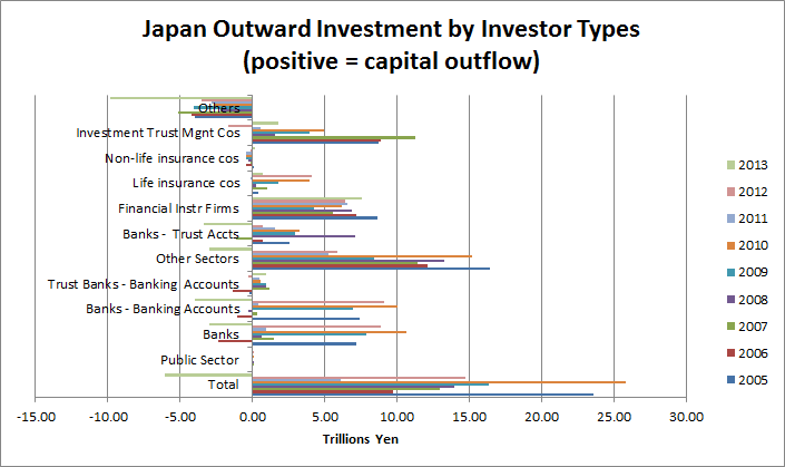
Outward Investment Flows
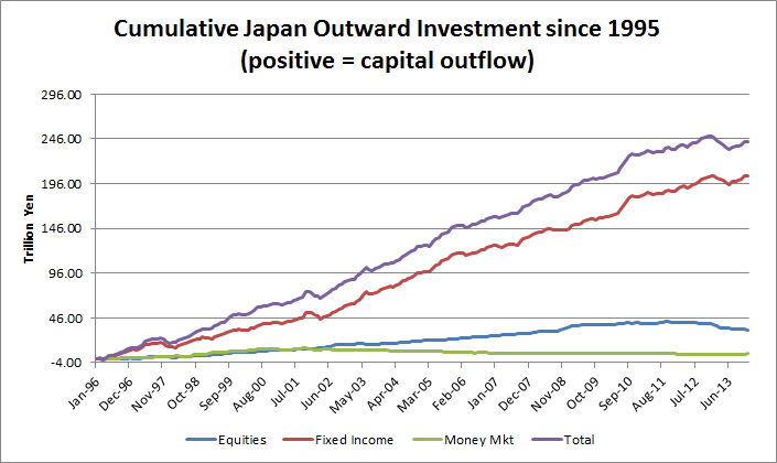
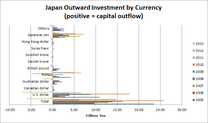
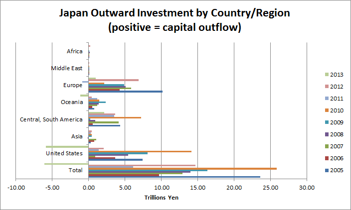
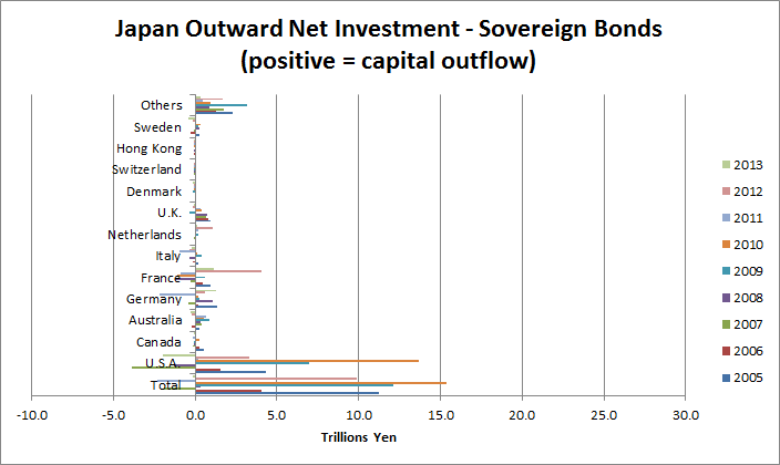
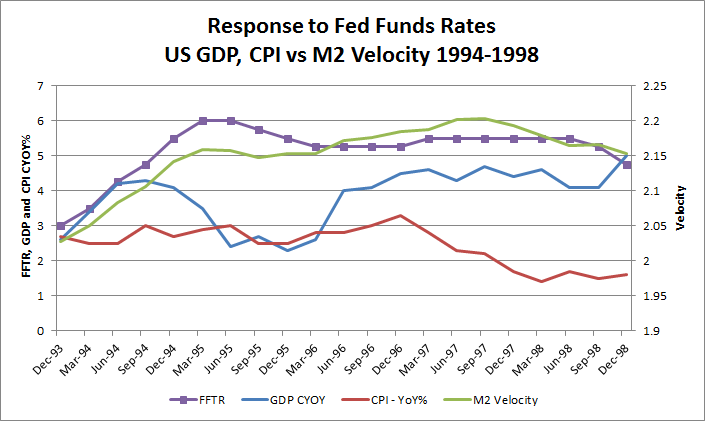
1993-1998: The Yen Carry Trade
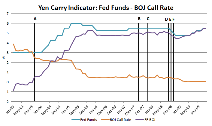
...Tiger Management, until recently the largest such fund in the world. In its heyday in the summer of 1998, Tiger had more than $20 billion under management, considerably more than George Soros' Quantum Fund, and was reputed to be even more aggressive than Quantum in making plays against troubled economies. Notably, Tiger was perhaps the biggest player in the yen "carry trade"--borrowing yen and investing the proceeds in dollars--and its short position in the yen put it in a position to benefit from troubles throughout Asia. But when the yen abruptly strengthened in the last few months of 1998, Tiger lost heavily--more than $2 billion on one day in October--and investors began pulling out. The losses continued in 1999--from January to the end of September Tiger lost 23 percent, compared with a gain of 5 percent for the average S&P 500 stock. By the end of September, between losses and withdrawals, Tiger was down to a mere $8 billion under management.
Transmission of Carry Trades: Merrill Lynch - a Proxy for US Brokerage Firms/Banks
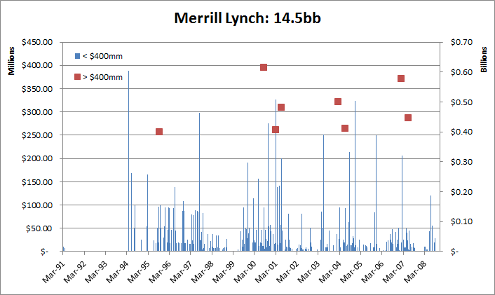
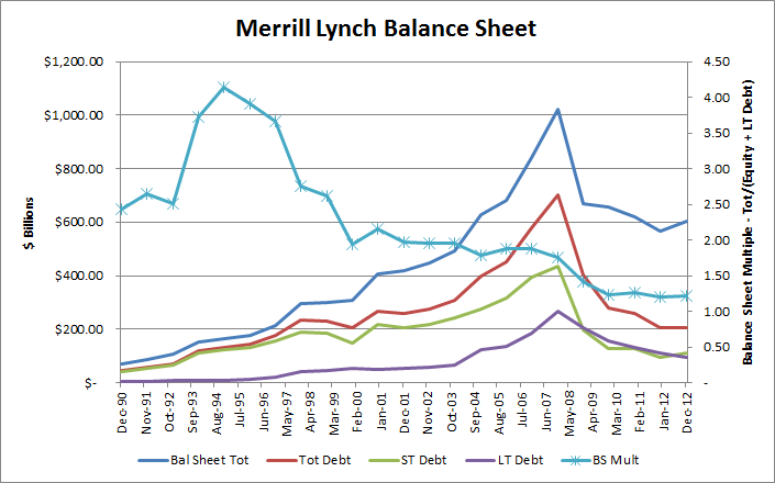
Summary:
- Yen Borrowing or Selling - Funding in Yen through banks, plus currency trading of of Yen for other currencies (Mrs. Watanable)
- Japanese Purchases of Bonds and Trusts denominated in foreign currencies (including EuroYen bonds).
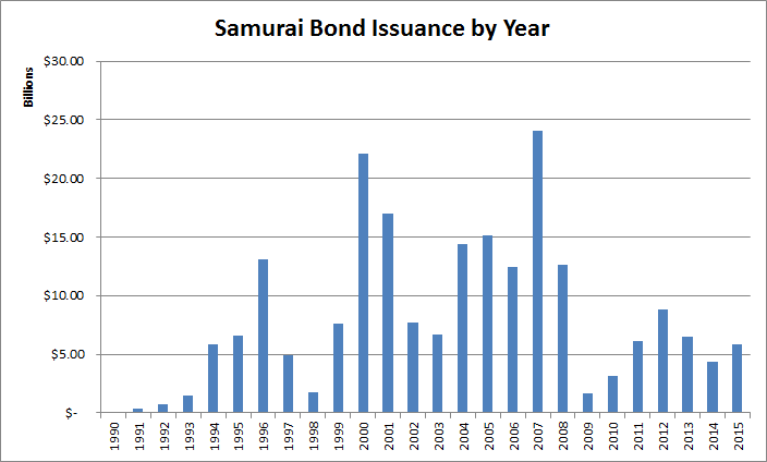
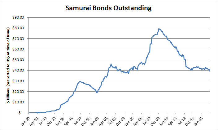
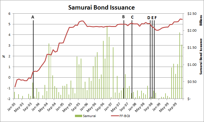
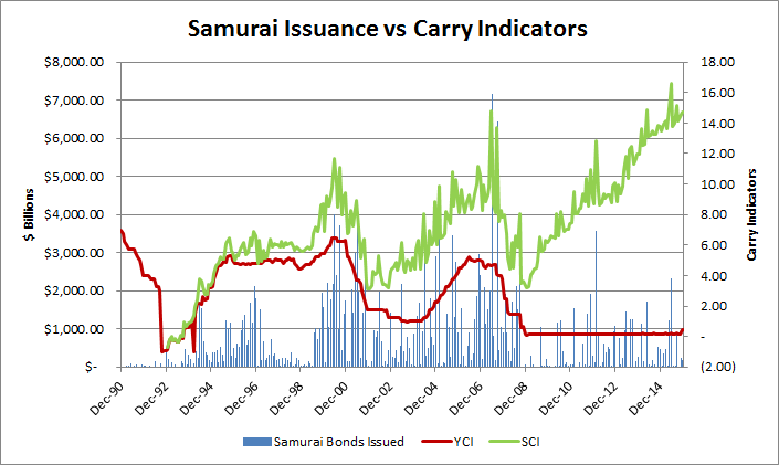
- Samurai bonds issuance by American financial institutions, increasing bank capital and leveraging the balance sheets of US banks.
- Quantitative Easing by the BOJ, exporting capital both directly (purchasing foreign Sovereign bonds) and indirectly (injecting money in to Japan's economy by purchasing JGBs, which then gets exported by the Japanese - see #2 above).
Section 2: The Pricing of Assets
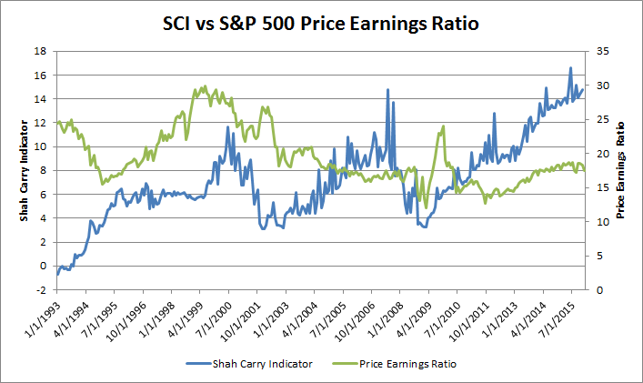
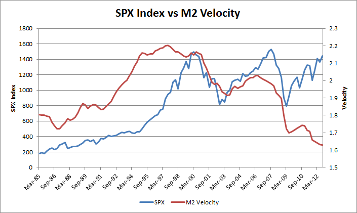
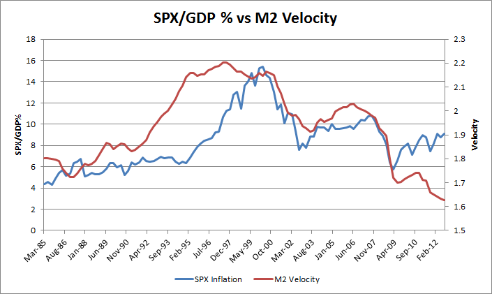
SCI and the S&P 500 Price Earnings Ratio
SCI and US Treasury Bonds
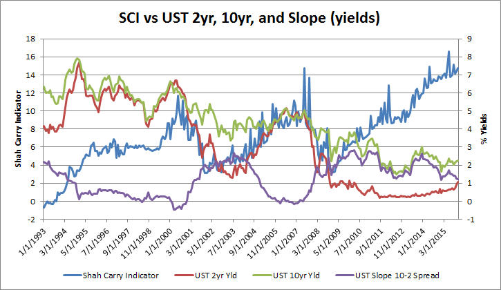
... For one, market yields had increased quite sharply in anticipation of Fed tightening in 2004. Market yields were much lower in mid-March 2004, before investors began to worry about a change in Fed policy. Some yields increased as much as 100 bps between mid-March and late-June.
"The weak job market should concern every American. It imposes hardship on people.."
Section 3: The Failure of Macro Economics
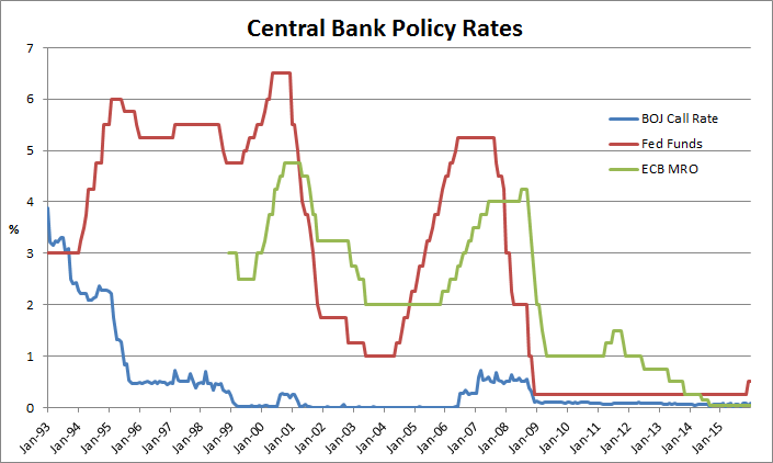
- - Central banks derive their power from the fact that they are monopoly providers of “high powered” money (base money).
- - Central banks choose the price (rate) at which they lend high powered money to the private sector - the Policy Rate eg. Fed Funds Rate or Uncollateralized Overnight Call Rate.
- - This official rate is transmitted to other market rates via the banking system to varying degrees, and impacts assets prices and expectations, as well as the exchange rate.
- - These changes in turn effect spending, savings, and investment behavior, which impacts the demand for goods and services.
- - Monetary policy works via its influence on aggregate demand in the economy. Monetary policy thus determines the general price level, and the value of money i.e. the purchasing power of money. (Inflation is thus a monetary phenomenon. )
- - Changes in the policy rate lead to changes in behavior of both individuals and firms, which when added up over the whole economy generate changes in aggregate spending.
- - Total domestic expenditure in the economy is equal to the sum of private consumption expenditure, government consumption expenditure and investment spending. This, plus the balance of trade (net exports) is equal to GDP.
- - Monetary policy changes affect output and inflation, as well as inflation expectations. - Inflation expectations influence the level of real interest rates and so determine the impact of any specific nominal interest rate. They also influence price and money wage setting, and so feed into actual inflation in subsequent periods.
- - Money supply plays a role in the transmission mechanism of policy, but is not a policy instrument nor a target, as the central bank has an inflation target, and uses monetary aggregates as indicators only.
- - There is a positive relationship between monetary aggregates and the general level of prices. From the BOEs paper: “Monetary growth persistently in excess of that warranted by growth in the real economy will inevitably be the reflection of an interest rate policy that is inconsistent with stable inflation. So control of inflation always ultimately implies control of the monetary growth rate. However, the relationship between the monetary aggregates and nominal GDP ..appears to be insufficiently stable (partly owing to financial innovation) for the monetary aggregates to provide a robust indicator of likely future inflation developments in the near term.”
- - Shocks to spending can have their origin in the banking system, that are not directly caused by changes in interest rates
- – Examples include declines in bank lending caused by losses of capital on bad loans: a credit crunch.
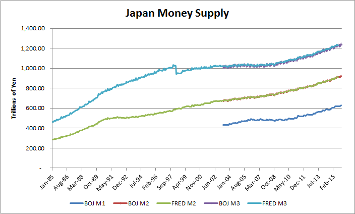
- - M1 is usually a narrow definition - coins and notes in circulation
- - M2 is typically M1 plus short term bank deposits, savings and checking accounts, money market funds, etc.
- - MZM - Money Zero Maturity - A measure of the liquid money within an economy. MZM represents all money in M2 less the time deposits, plus all money market funds
- - M3 is M2 plus longer term deposits
- - Some countries have even broader definitions.
In terms of the quantity theory of money, we may say that the velocity of circulation of money does not remain constant. “You can lead a horse to water, but you can’t make him drink.” You can force money on the system in exchange for government bonds, its close money substitute; but you can’t make the money circulate against new goods and new jobs.
- * Inflation Target
- There are 3 types of inflation that matter
- - Goods Price Inflation
- - Wage Inflation
- - Asset Inflation
- * Full Employment
- - measuring employment and unemployment is a favorite sport of economists
- - the headline unemployment number does not represent reality
- * GDP growth
- - we need to look into the components of GDP growth.
- - it is relatively easy for an administration to increase the size of government, but if it is not productive, it will not lead to Velocity of money.

" The trouble is, Japan is 100 mm people on a few islands, and if they allowed their industrial base to hollow out, the country would become indefensible without projecting military strength throughout Asia, not to mention a banking system with significant resilience and reach as well."
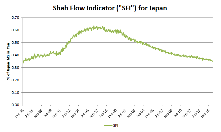
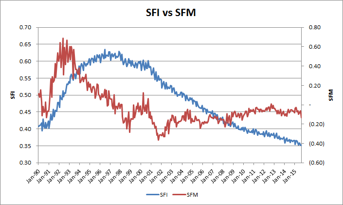
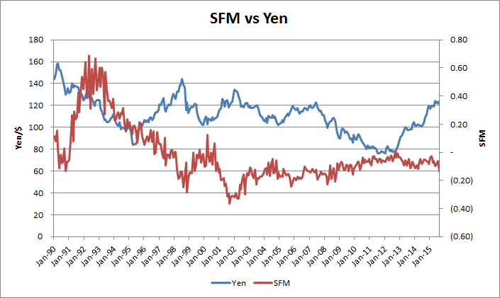
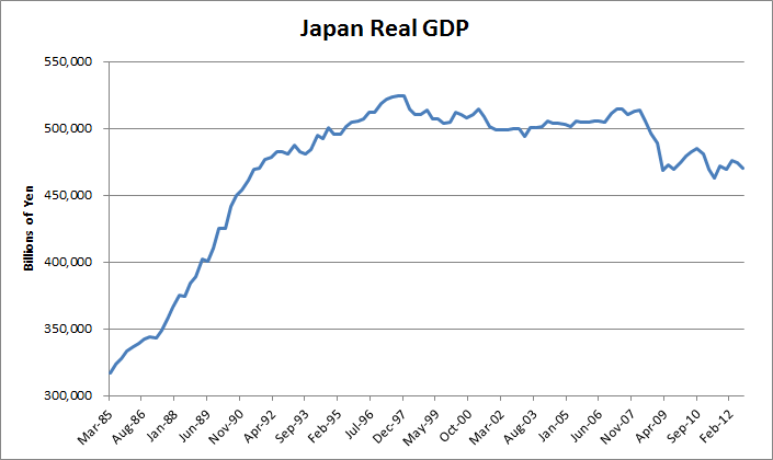
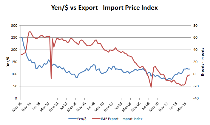
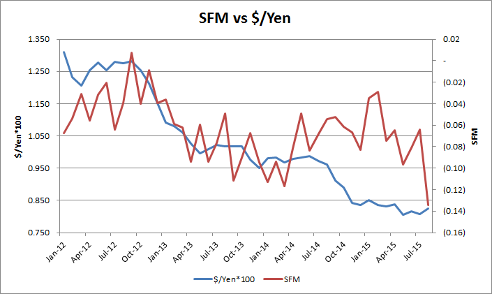
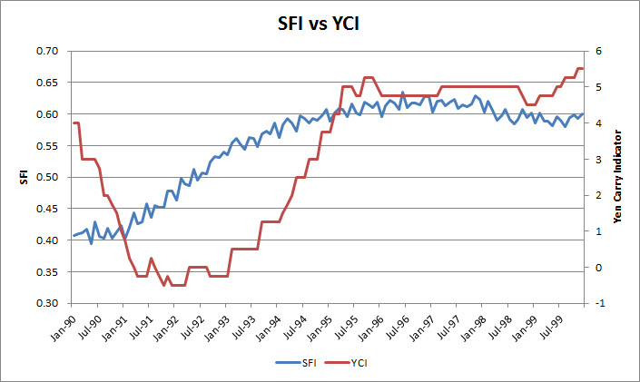
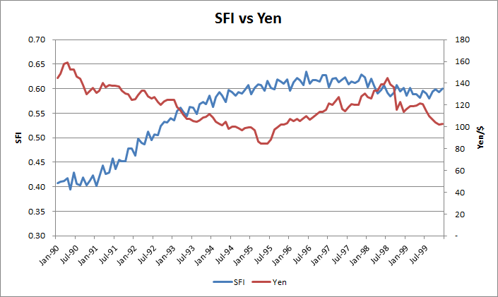
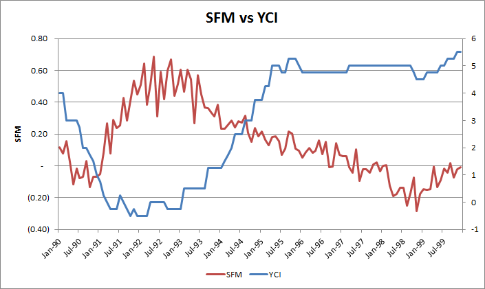
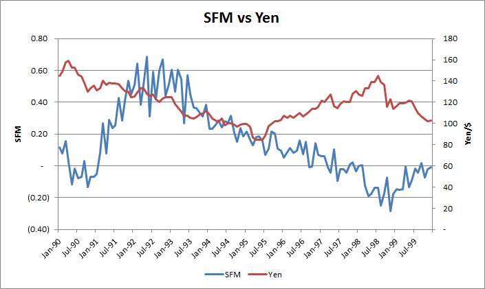
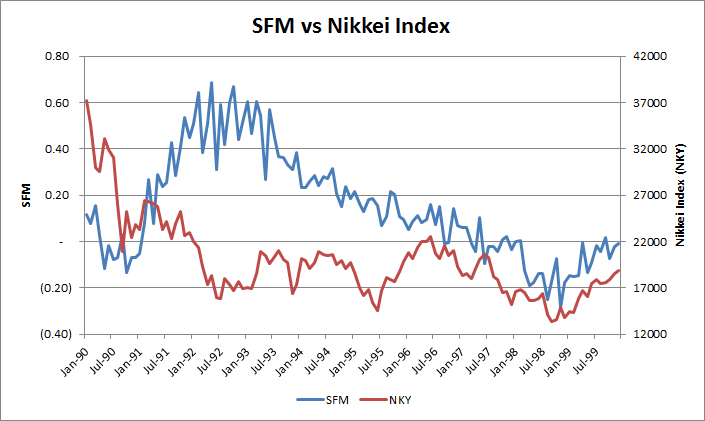
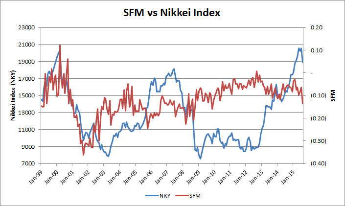
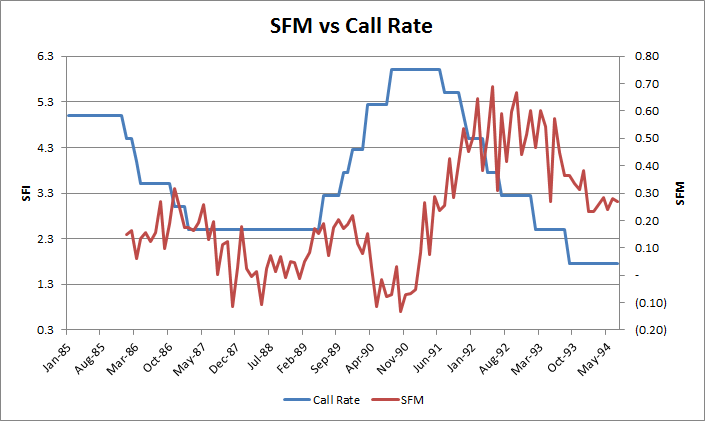
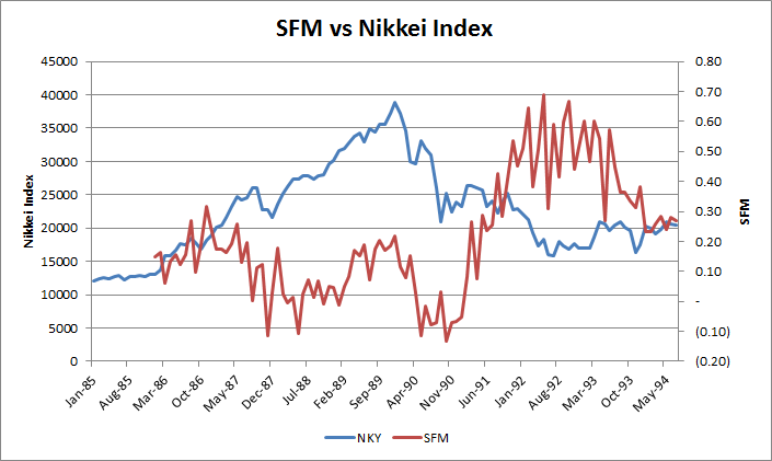
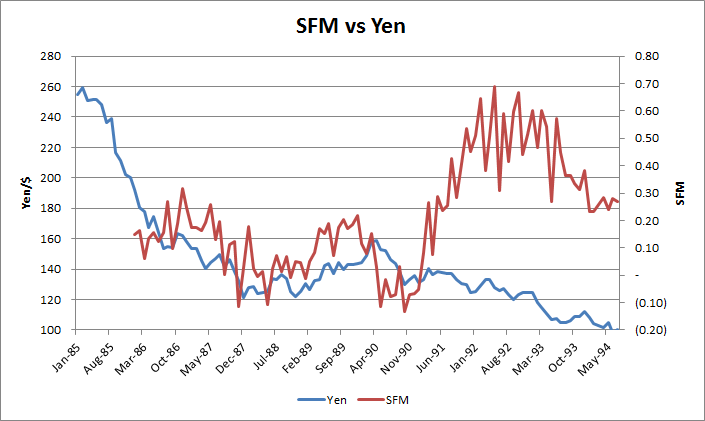
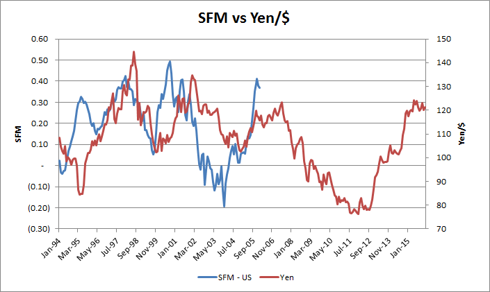
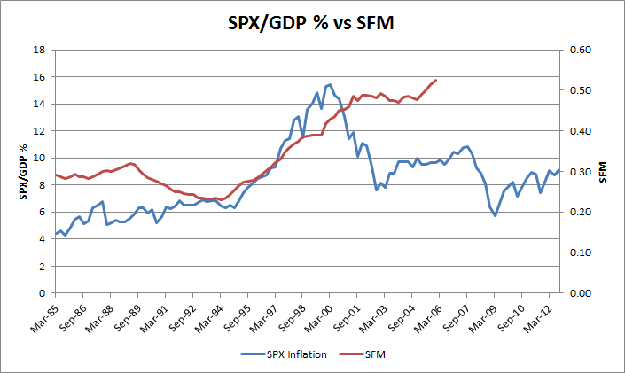
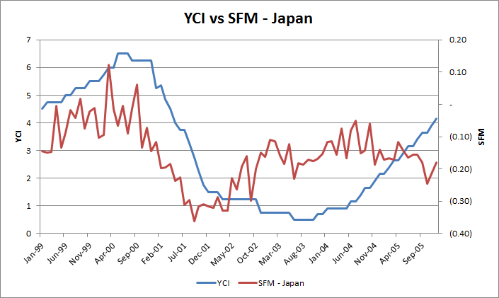
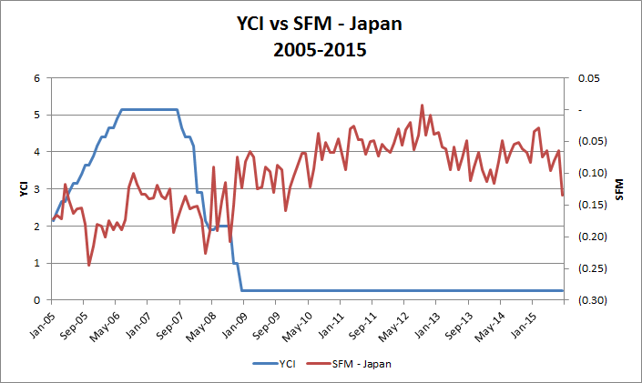
4) This chart summarizes the recent story of Japan's economy. From it we see that:
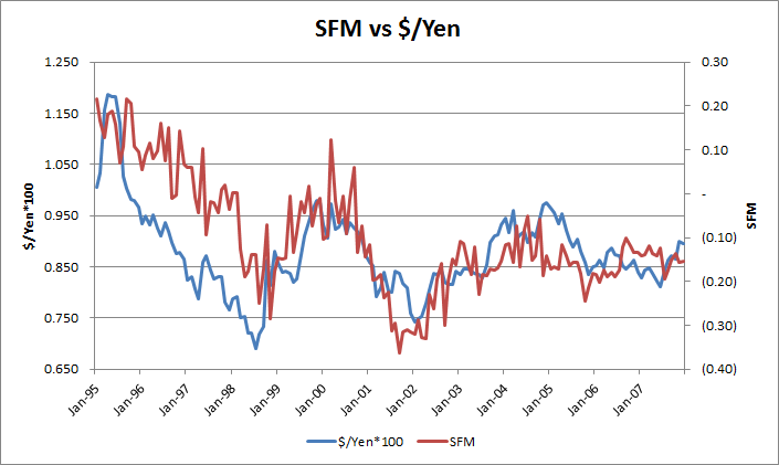
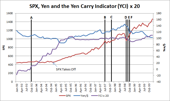
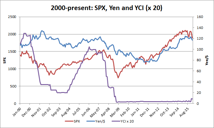
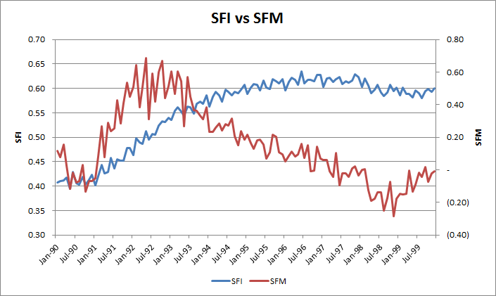
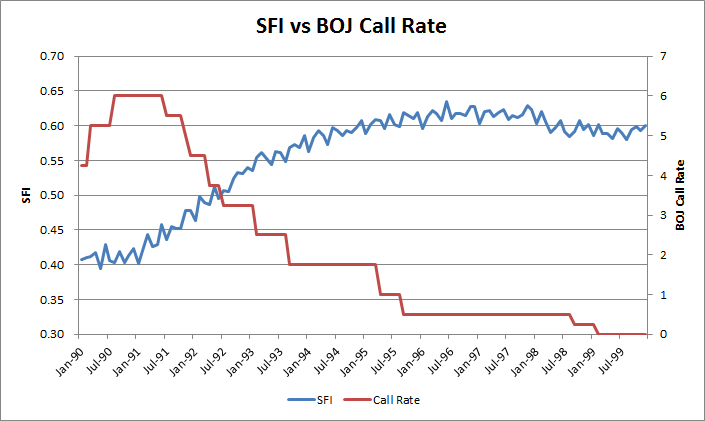
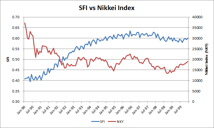
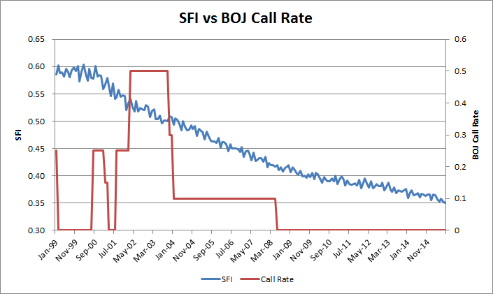
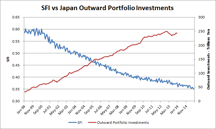
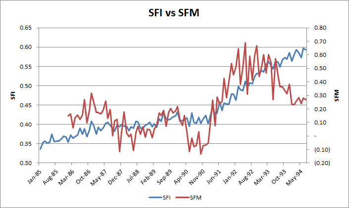
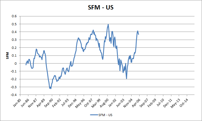
- prior to 1995 the SFM had a different relationship to the Yen; in 1994, something changed.
- the Carry Trade started around 1994. This connects Japan's money supply post-1994 to many of the charts and correlations I have shown above. Starting in 1995 (due to the lag), SFM, and thereby SFI, have a close relationship with Yen, implying most of the changes in IC come from changes in flows between Japan and other economies.
- the strong relationship to the Yen-Dollar cross suggests that the US was a large receipient of Carry from Japan
- the relationship changed after 1998-1999, again in 2008, and then again in mid 2012. However, they are still related, only the coefficients of the relationship have changed.
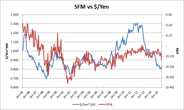
The change in the relationship between SFM and Yen/$ probably reflects a netting of currency flows versus investor flows:
The following are the likely counteracting forces that change the strength of the SFM-Yen relationship:
a) substitution of another country for Yen outflows from the US, rather than repatriation to Japan - very likely. For further analysis I might look into the commodity and BRIC countries and currencies - Australia, Canada, etc;
b) 2008-2012: BOJ's UST holdings more than doubled, while at the same time, Japanese investors were withdrawing capital from the US. The Bank of China too is a large holder of USTs. These are both sources of additional QE.
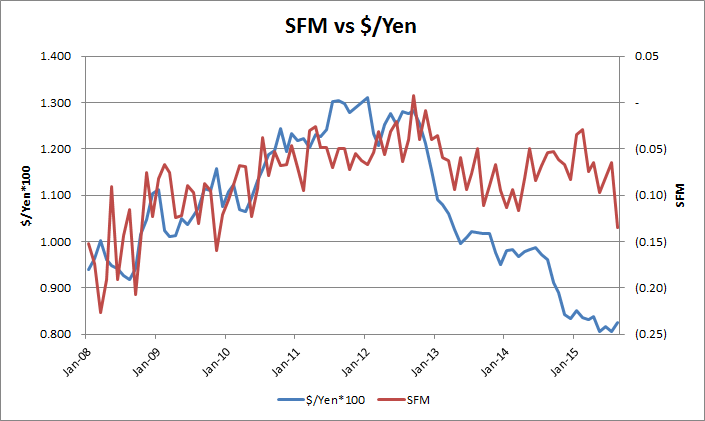
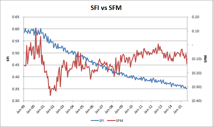
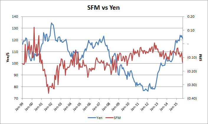
The post 2012 period is complicated, with many counteracting forces impacting the Yen and SFM, changing the strength of the SFM-Yen relationship multiple times.
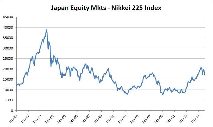
c) Starting 2012, Abenomics kicks in, dramatically increasing the BOJ's balance sheet and holdings of JGBs. If done purely internally, this should have resulted in an increase in IC and SFM for Japan. However, Abenomics also explains the spike in the Nikkei Index, which would reduce IC. I suspect that the rhetoric also resulted in substantial speculative selling of the Yen, as Abe wanted to boost exports. This combined resulted in a net reversal and decline in SFM, but at a lower rate than we would have expected from the prior relationship.
The weakening of Yen/$ would suggest that this money landed in the US. The Fed also embarked on QE3. It is thus hard to separate the causes for the resulting spike in the S&P. This would be something interesting to investigate later.
It is also possible that my definition of SCI is not fully correct, as I do not subtract the high Cash balances at the Fed that would reduce the impact of the Fed's Balance sheet. So it is possible that flows from Japan are still driving the US Stock Market. This is identified by the Yen - in spite of negligible YCI, they might have been attracted by the signalling effect of US QE.
d) post 2013 - BOJ reduction of UST purchases and holdings - which should have strengthened the Yen.
e) post 2012 - Abenomics creating some $-carry from US hedge funds betting on Japanese Reflation, which should have strengthened the Yen/$, but not enough to overcome the Japanese outflow of capital, the net result of which was continued Yen weakening. In addition the Japanese might still be exporting capital to other countries, which would result in IC and SFM decreasing in Japan.
f) 2015 - Japan reducing its UST holdings (resulting in negative swap spreads in the US), which should strengthen the Yen.
Yen Carry trade - this is the $1 trillion question mark - how much and how rapidly will this unravel?
* Anecdotal evidence suggests that Japanese housewifes have supported this heavily with retail savings (so called "Mrs Watanabes") everytime the dollar has strengthened, selling more Yen and buying $ and USTs. Will they come to the rescue? Or with USTs rallying, and rates rising in Japan, will they give up and buy back the Yen?
* I STRONGLY BELIEVE THAT THE YEN CARRY TRADE IS THE REASON THE FED CANNOT CUT RATES.
* The system may not be able to handle an additional 1 trillion of deleveraging.
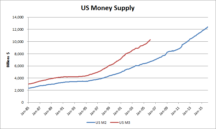
US Money Supply
On March 23, 2006, the Board of Governors of the Federal Reserve System will cease publication of the M3 monetary aggregate. The Board will also cease publishing the following components: large-denomination time deposits, repurchase agreements (RPs), and Eurodollars. The Board will continue to publish institutional money market mutual funds as a memorandum item in this release.
Measures of large-denomination time deposits will continue to be published by the Board in the Flow of Funds Accounts (Z.1 release) on a quarterly basis and in the H.8 release on a weekly basis (for commercial banks).
M3 does not appear to convey any additional information about economic activity that is not already embodied in M2 and has not played a role in the monetary policy process for many years. Consequently, the Board judged that the costs of collecting the underlying data and publishing M3 outweigh the benefits.
The growth in M2, but the even greater growth of M3 after 1995: Signs of the Carry Trade!
During the first and second quarters of 2014, the velocity of the monetary base^2 was at 4.4, its slowest pace on record. This means that every dollar in the monetary base was spent only 4.4 times in the economy during the past year, down from 17.2 just prior to the recession. This implies that the unprecedented monetary base increase driven by the Fed’s large money injections through its large-scale asset purchase programs has failed to cause at least a one-for-one proportional increase in nominal GDP. Thus, it is precisely the sharp decline in velocity that has offset the sharp increase in money supply, leading to the almost no change in nominal GDP (either P or Q).So why did the monetary base increase not cause a proportionate increase in either the general price level or GDP? The answer lies in the private sector’s dramatic increase in their willingness to hoard money instead of spend it. Such an unprecedented increase in money demand has slowed down the velocity of money, as the figure below shows.
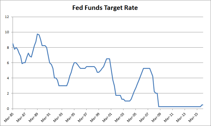
After the lengthy peacetime expansion of the 1980s, inflation began to increase and the Federal Reserve responded by raising interest rates from 1986 to 1989. This weakened but did not stop growth, but some combination of the subsequent 1990 oil price shock, the debt accumulation of the 1980s, and growing consumer pessimism combined with the weakened economy to produce a brief recession.
In a surprise move, the Federal Reserve slashed short-term interest rates Wednesday and signaled it is ready to make further cuts to keep the U.S. economy from sliding into a recession.
The move, which came nearly four weeks ahead of the Fed's regularly-scheduled policy meeting, caught most investors off guard, triggering a mighty rally on Wall Street with the Nasdaq composite posting its best day ever and the Dow industrials surging nearly 3 percent.
 Daily 12-26-00 to 12-31-01.png)
 Daily 12-26-00 to 12-31-05.png)
 Dai 2016-02-23 23-40-57.png)
"Today's action is intended to help forestall some of the adverse effects on the broader economy that might otherwise arise from the disruptions in financial markets and to promote moderate growth over time," the Federal Open Market Committee said in a written statement.
 2016-02-24 10-19-48.png)
 2016-02-24 10-41-39.png)
 Daily 2016-02-24 11-16-37.png)
 Daily 2016-02-24 11-26-43.png)
What could Bernanke have done differently?
1) What's needed is a Reserve Requirement Cut. A cut in this will allow banks to lend more and increase the size of their balance sheets. It will also lead to a drastic expansion in money supply, and will probably lead to inflation.2) Well, how about RAISING the Fed funds rate simultaneously. Now, I'm not only out on a limb, but over a precipice!The reserve requirement cut will allow banks to find the balance sheet for all the trillions in excess assets that we've created over the past 5 years. And the RATE RISE, will help dampen inflation, and also allow Mrs Watanabe (and the hedge fund community) to happily continue shorting the yen to support our stock markets. This will defer the yen carry trade liquidity problem for some time, and allow the central banks of the world to deal with it later. In fact, it may allow the BOJ to raise rates, as it's been hinting it wants to do.
Section 4: Topics of Present Concern
Most comments I have read about deflation discuss central bank negative rates as indicating that central banks are not in control and therefore, if inflation does not result, then deflation will. These are mostly sound bites, without foundation.
When people are discussion Deflation, they are usually referring to the CPI, and often GDP growth. They should also be discussing Wages and Asset inflation and deflation.
Deflation occurs as Money Supply is diverted from the domestic economy, either into Asset Inflation, or Overseas Capital Markets, or Asset Inflation overseas. You can follow M3 and M2 Money Supply to see if this is happening inside or outside an Economy, by using SFM and Stock/GDP ratios.
If money supply is retained in an economy, then it will be divided between GDP creation and Asset Inflation creation. This split will be determined by whether the economy has satiated its demand for goods through the purchasing of goods during previous expansions. Wage growth will also play a factor, and that will be determined by supply of labor through population growth, relative wages between countries for manufacturing, and other factors. This is not a trivial topic for a sound bite.
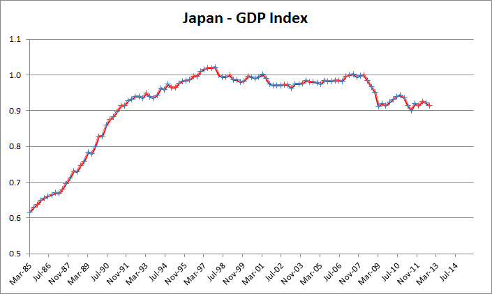
However, observing historical GDP trends is likely to be enough to judge when an economy has peaked, after which additional money supply will lead to Asset Inflation. I suspect that the US is in this latter camp. Without GDP growth, we are unlikely to get wage growth either.
In today's world, Asset Inflation and Deflation are determined purely by QE.
As long as Asset Inflation is not part of CPI, CPI is likely to remain stable, since GDP today is being determined by a replacement cycle (my opinion - we built and own enough stuff in the years leading up to the Great Financial Crisis), not an investment cycle, and is unlikely to grow very fast any more.
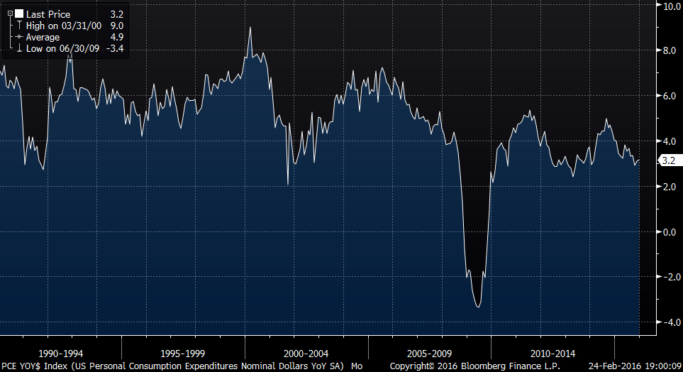
This graph gives hints about what I mean - compare Personal Consumption pre-Yen Carry (pre-1994) - around 6%, post Yen Carry in the 1990s - grew to 8%, 2004-ish grew to 6% and then declined to 4% by 2008. This decline from 2004-2008 is indicating to me that we have hit "Peak-Stuff", and that we did so in 2004 in spite of a growing economy and growing money supply. Currently we are back at under 4% PCE growth. I do not think US GDP growth is going anywhere soon.
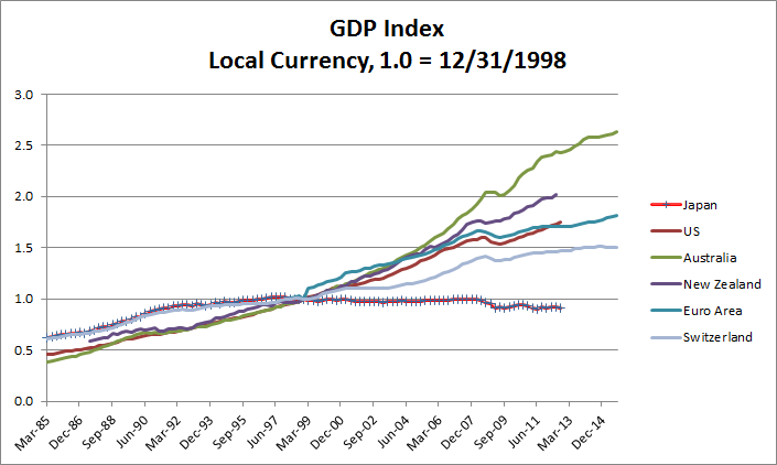
This is likely for other industrialized nations too - all benefited from the Yen Carry trade, and their GDPs expanded at the same time ours did.
Too Big to Fail Banks
This is connected to the concept of "Peak Stuff". We should have never bailed out the banks, as we did, and still have too much banking capacity for the size of our economy and GDP growth. We need to get rid of their implicit guaranty by explicity announcing that it has been withdrawn, and that if a bank takes risk, it does so on its own. This will limit bubble creation, as CEOs of banks and investment banks will have to be more prudent with risk taking. The current Oil debt potential Crisis would be a great time to test this.
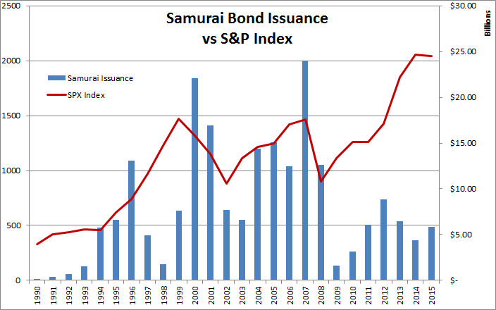
Another way to shrink banks is to eliminate Samurai bonds as sources of capital.
I made the following recommendation in Crisis Note 2008-04:
Until we close our economy to foreign financial flows (I don't believe this will happen, I'm a Chicago school geek!), the correct things for the Fed to do is to continue focusing on financial price stability - by taking the things that have worked (TAF, etc. - providing balance sheet and emergency funding to IBs) to their logical conclusion - charge investment banks for the insurance, treat them the same as banks, and deal with the risk and capital requirement issues of off-balance-sheet structures. In order words, eliminate itself as a central bank, and become a regulator.
"Japanese Reflation" - seems to have been a "Trade-du-Jour" of Macro Funds
The "Japanese Reflation Trade" will not work under current economic system and economic policies. In order for this to happen, significant policy changes need to be made to repatriate capital back to Japan in an orderly manner, allowing its money supply to inflate and thus create domestic inflation. Negative rates certainly will not accomplish this.
One of the primary effects of Macro Economic failures is Income Inequality. Those that control assets benefit greatly from Asset Inflation, often in a levered manner, leaving others behind. This is increasingly becoming a significant social issue.
I suspect that Birth rates in Trapped Economies stall out because the Economies are in a Liquidity Trap. Such is the case with Japan. Without a vibrant and growing Economy, one does not have hope in the future - people do not marry and do not have children. Birth rates plummet, leading to a downward spiral. A topic to be investigated later. Southern Europe as well?
China
I have not thought too much about China, as their links to the world are not Market Based, and it is hard to analyze. In addition, I was more interested in analyzing the US economy, but it turned out that the best way to do that was by analyzing Japan. So what I say about China is an opinion that has not been well researched.
Unlike Japan, whose savings and Trade Surpluses have been invested overseas in Securities and Leverage providing, China appears to have been buying hard assets with its surpluses. The most interesting thing about China, to me, is its UST portfolio - China is the the largest holder of USTs, but barely ahead of Japan. If they are forced to sell this portfolio, it will cause some ripples, but as I discussed in my Interest Rate Swaps article, negative swap spreads suggest that USTs are cheap. US and European investors will buy them - the US 10yr yields more than Italy's 10yr.
In addition, I view China as a symptom of the Yen Carry Trade - they would not have a surplus if Japan had not lent us the money to boost our GDP for 20 years! That is not to say they are not important. However, I don't think they will add explanatory power to this analysis.
Japan owns, or at least has claims on, far more of our economy's debt than China, once one factors in private debt. One of the things I learned in Merton Miller's class at the University of Chicago was that debt is a call option on equity - Japan has far more power over the US than China in this regard, if it chooses to leverage it. This is why every US dignitary that goes East visits Japan before China.
Some investors are worried about China's banks. I think this is unfounded for multiple reasons. China's economy and currency do not float. They can easily close their borders to currency flows, buy out all domestic bank debt, and create domestic inflation to create a soft default. They can also mandate debt extensions - replace all debt with 0% perpetuals for example. In the same manner that the US bailed out its banking sector, China can and will likely bail out theirs, especially since it appears that much of the Credit expansion was mandated or at least tolerated by the government in the first place.
Further Analysis and Research
- Trying to identify the trigger points at which Carry Flows reverse.
- Modelling the post 2010 money supply sources to separate effects from US QE, foreign QE, USD Carry, etc, to identify the importance and coefficient of each source of Carry in the SCI.
- Model Japan's SFM more comprehensively.
- Find a substitute for US M3, so current SFM-US can be modelled.
- Investigation of USD Carry exports due to the US entering a Liquidity Trap
- Investigation of Liquidity Traps going viral to other economies in addition to the US
Policy Brainstorming
Important Notice - Disclaimer
This overview is being provided to you by MBS Mantra, LLC (“MBS Mantra” or the “Firm” or the “Adviser”), for informational purposes only, on a confidential basis and is intended solely for use by the company or individual to whom it is being delivered. Potential investors are advised to request and carefully read and review MBS Mantra’s Firm Brochure (Form ADV Part 2), and other documents, if any, provided by MBS Mantra (the “Documents”).
Under no circumstances should this overview be used or considered as an offer to sell, or a solicitation of any offer to buy, interests in any securities, funds, other financial products or investment strategies managed by MBS Mantra, nor shall it or its distribution form the basis of, or be relied upon in connection with, any contract for advisory services or otherwise.
The information contained with this brochure has not been audited and is based upon estimates and assumptions. No reliance should be placed, for any purpose, on the information or opinions contained in this overview. The information contained in this brochure is based upon proprietary information of MBS Mantra and public information, but it may not be comprehensive, and it should not be interpreted as investment advice. No representation, warranty or undertaking, express or implied, is given as to the accuracy or completeness of the information or opinions contained in this overview by MBS Mantra or by its affiliates and any of their principals, members, managers, directors, officers, employees, contractors or representatives.
Investors must make their own investment decisions based on their specific investment objectives and financial position. Charts, tables and graphs contained in this overview or in the Documents are not intended to be used to assist an investor in determining which securities to buy or sell or when to buy or sell securities. While this overview may contain past performance data, PAST PERFORMANCE IS NOT INDICATIVE OF FUTURE RESULTS, WHICH MAY VARY. There can be no assurance that any investment strategy will achieve its investment objective or avoid substantial or total losses. Except as required by law, MBS Mantra assumes no responsibility for the accuracy and completeness of any forward-looking statements. Further, MBS Mantra does not provide legal and tax advice; MBS Mantra recommends that investors consult with their own independent tax and legal advisers.
This overview and all Documents provided by MBS Mantra should only be considered current as of the date of publication without regard to the date on which you may receive or access the information. MBS Mantra maintains the right to delete or modify the information without prior notice; MBS Mantra undertakes no obligation to update such information, including, but not limited to, any forward-looking statements, as of a more recent date, except as otherwise required by law.